
Delta Group started its activity in 1996 in the city of Elbasan. During these 19 years the company has experienced expansive growth in all branches. This construction material company owes its success also to the partnerships and exclusive rights it has with prestigious mostly German companies. It is a parent business of well-known brands in Albania such as Delta Home, Dust, Deutsche Color and many other prestigious brands, which have been granted exclusive distribution and sales rights.
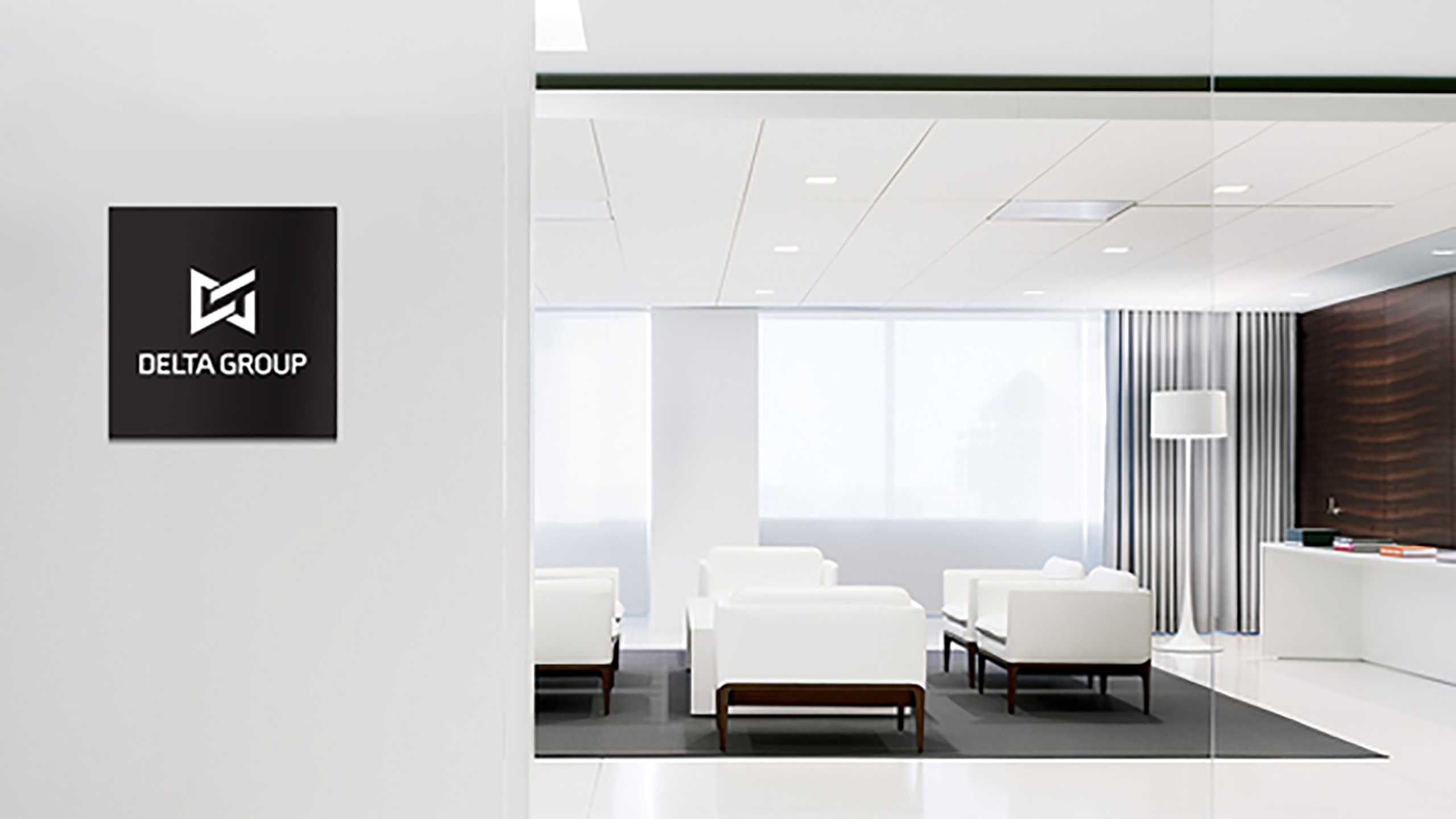
Delta Group requested a re-branding of the parent company image. The group wanted an institutional Logo, which included all the values of the company interwoven together. The values of the group are the primary element for the conception of the new image. The union of several companies in one group, the union of several individuals that have invested in these companies and in the group and all the other people that work together in all the companies of the group, with dedication and professional commitment. Likewise important is the context and company field of operation. The work resulted to be more difficult then we expected. After many hours of multidisciplinary research work we realized that many world-ranking companies had the same name and half of them belonged to the same industry. We were extremely limited in the elements we could use to design the new identity image. So we based our work on the brief. We focused on the coalescence and unity of the group. The strength that the group has, the directions the company takes. All these were interwoven together in DG initials. The inside corners have been curved in order to elevate the Logo on another dimension. This effect makes the combination even more harmonious, looking like a handshake even like chain links put together. The image includes and represents all the values that the institution aims to transmit to the public. Monochrome technique and film negative technique are appropriate for the application of the symbol in all identity elements and co-branding materials with which the group will promote its philosophy. The strength of the identity radiates from the combination of the letters DG with the logo and combination of the logo with the concept of unity. Thus the group is represented clear and strong in the symbol
