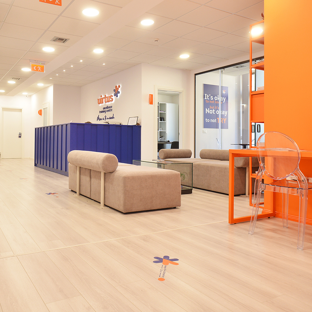
Virtus was created to meet the need for quality education and academic preparation for young people in various fields. The new training center equipped with new and modern laboratories and learning methods, requested Vatra’s expertise to create a visual identity.
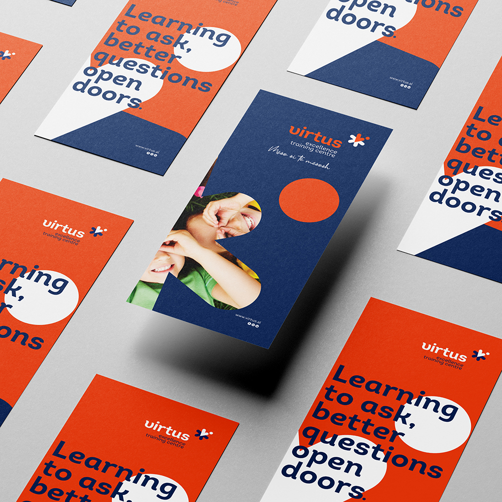
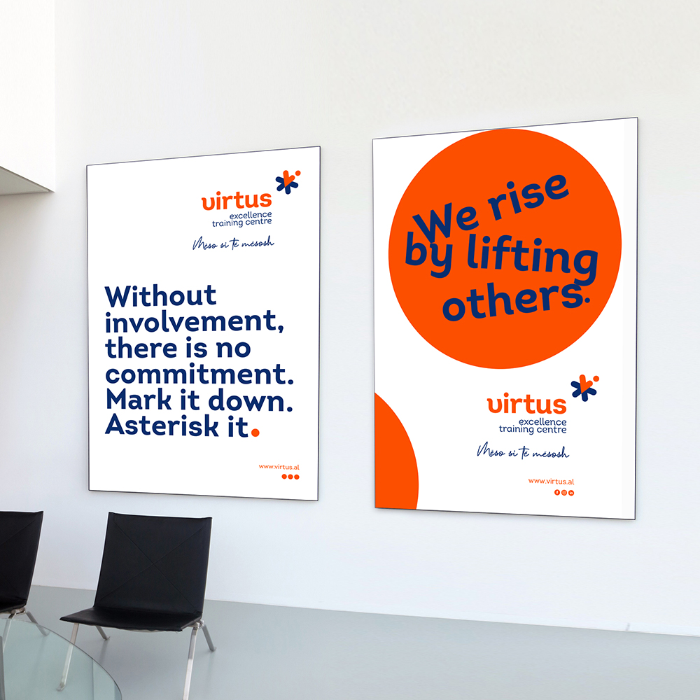
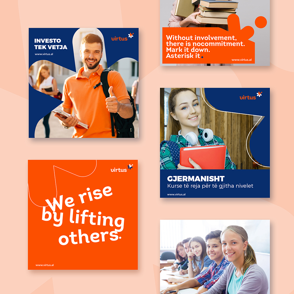
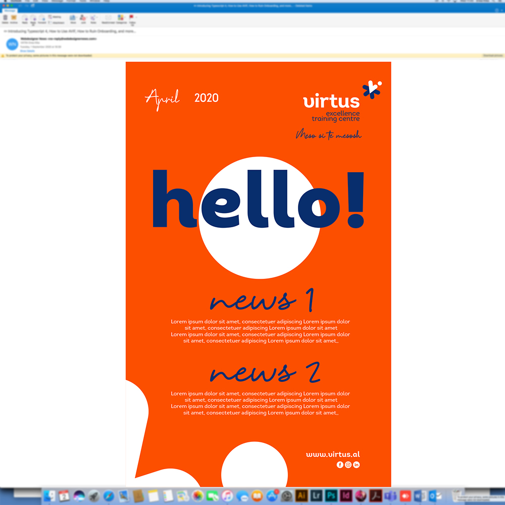
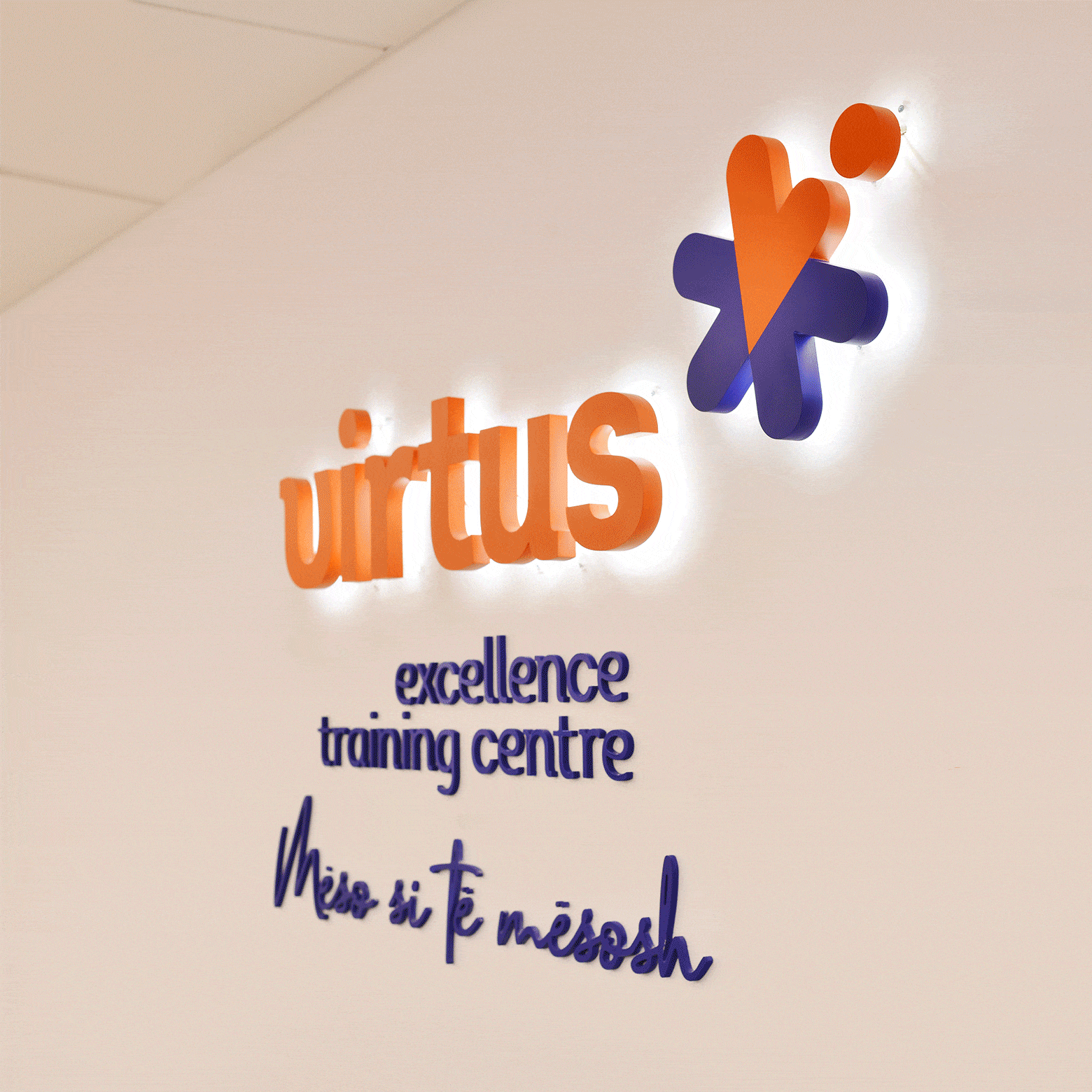
The logo created by Vatra contains the symbol of an asterisk, a star that represents quality, dedication and the multiple dimensions in academic studies. After concluding its training in the Virtus center, students can leave the center and advance in the chosen field. This “take off” of the individual is symbolized with an identifying dot on the logo. The concept was maintained in the entire brand range, indoor elements, graphics and animations on both social media and the website. The colors orange and blue in the brand symbolize the energy, dynamics and success of everyone who crosses paths with Virtus.
Every visual detail is in function of the mission of supporting a new generation of students to succeed in every part of the world in every field they choose to.