born for the throne
The top real estate agents take control of their careers just in their own way. This requires a high degree of self-motivation and drive, as well as smart decisions. Mikado is a relatively new real estate agency, that is identified precisely by the professionalism of its agents. It promises longevity in the real estate market, as if it was purpose-built for this mission.
for a glorious one
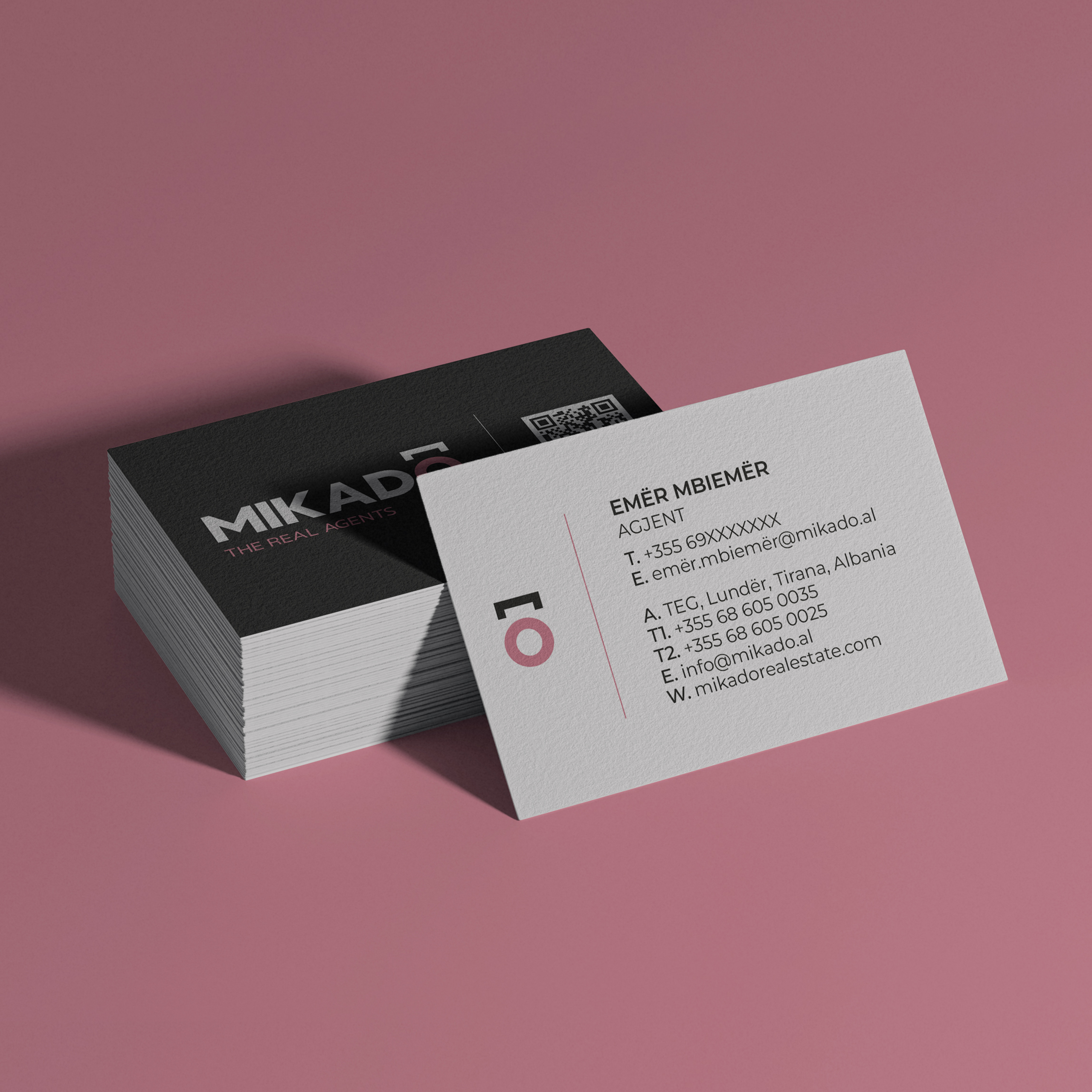
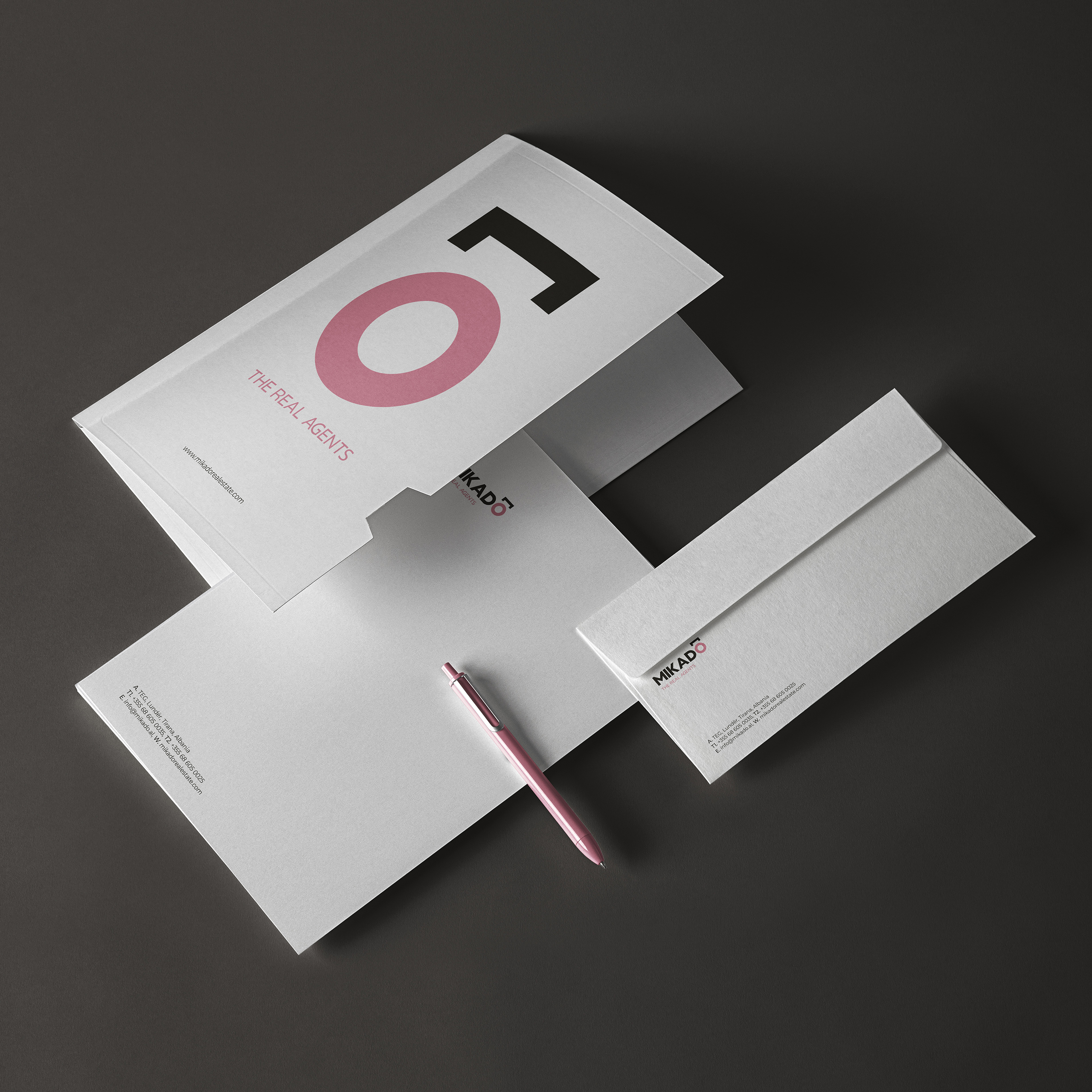
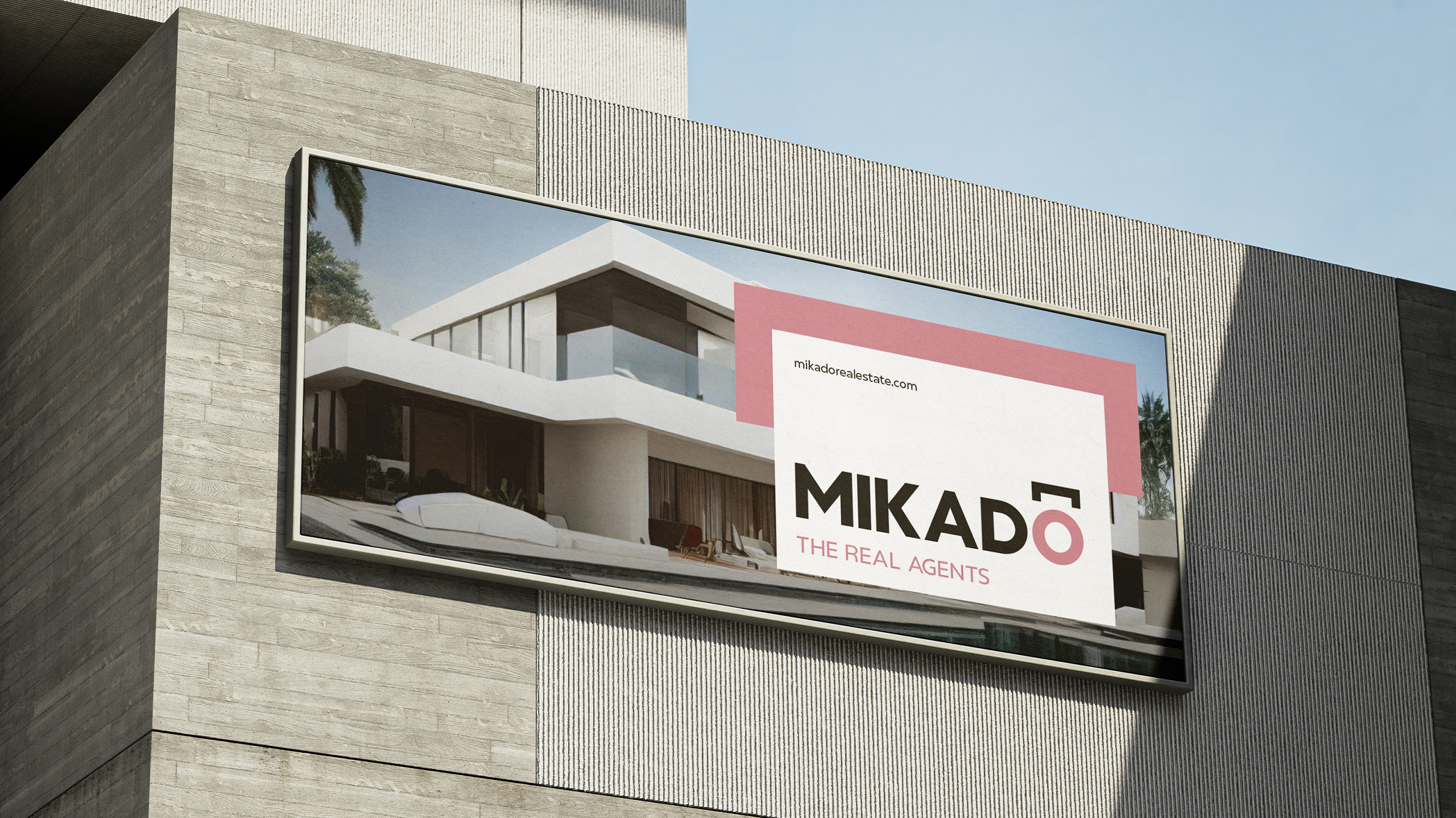
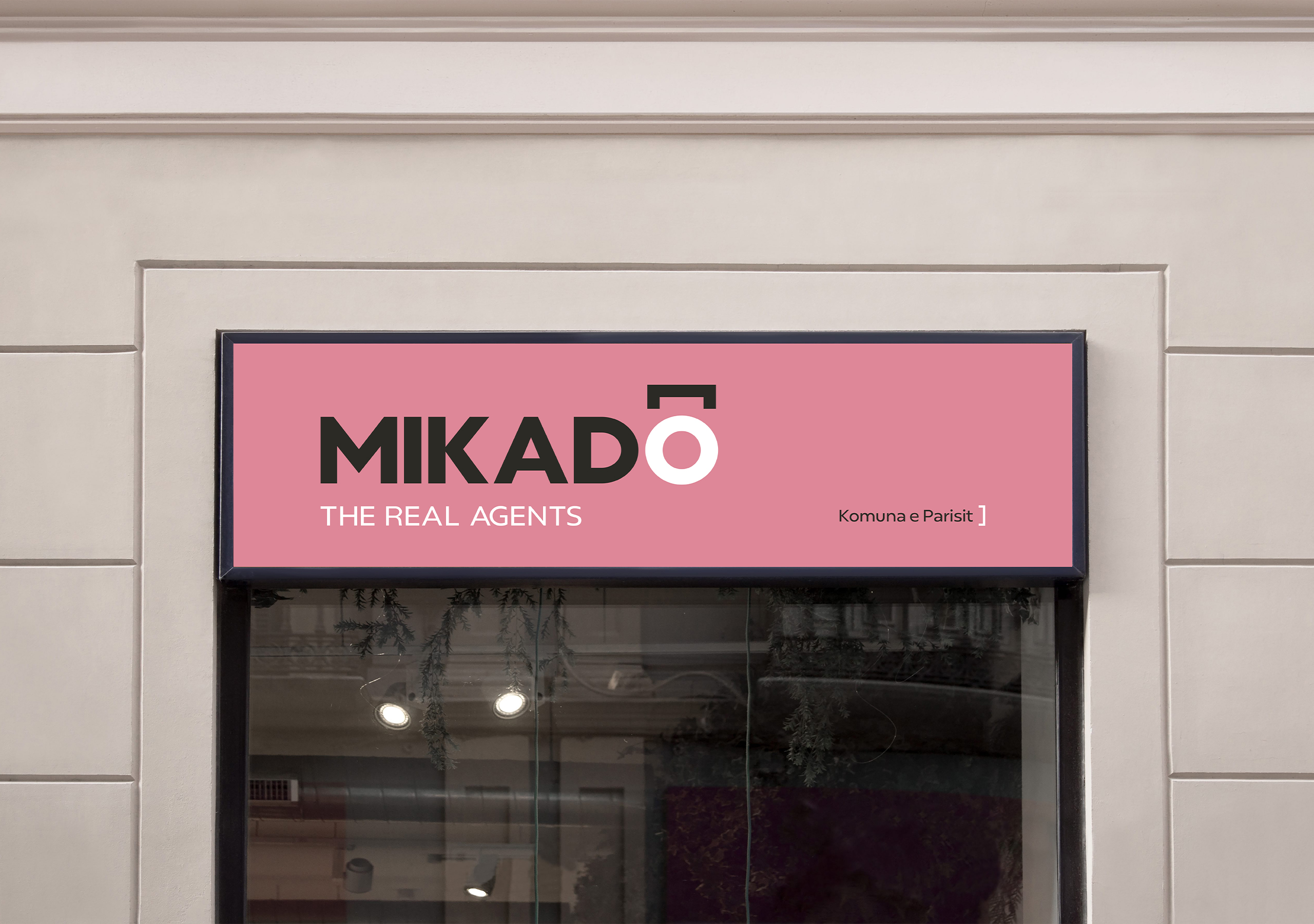
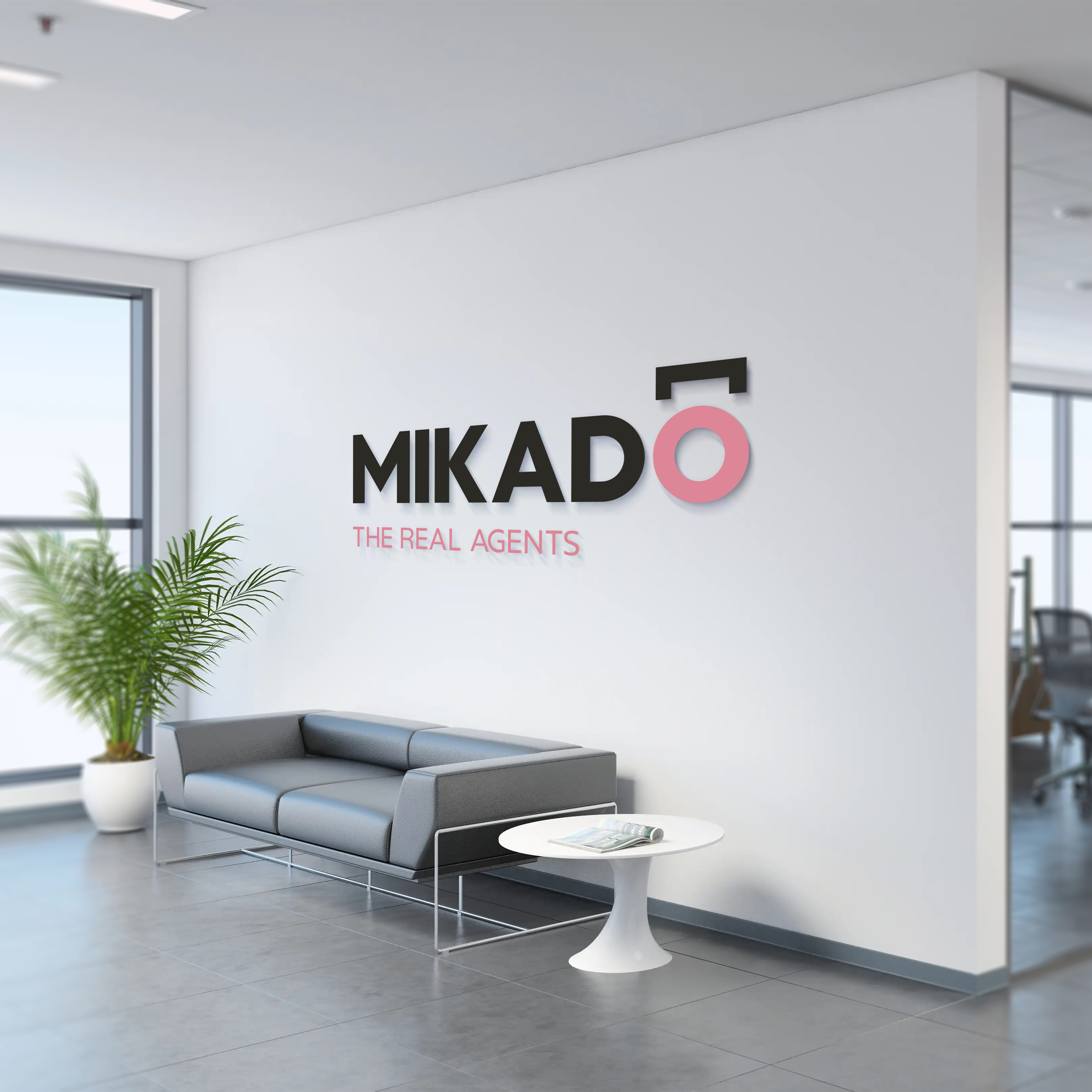
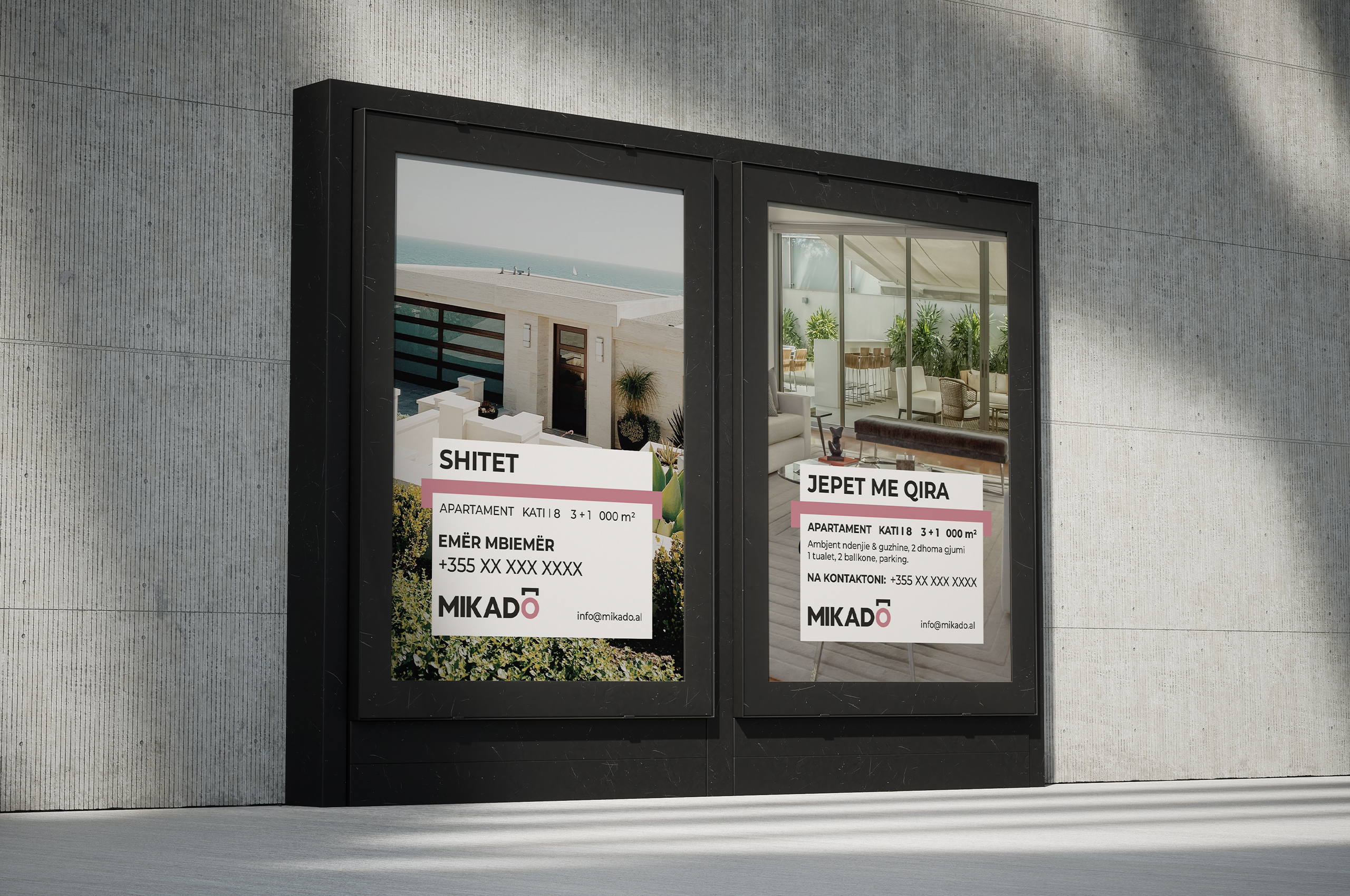
However, every starting point requires the right impetus; it brings you closer to success. Our team was committed to giving Mikado a solid brand identity that stands out among competitors. It all started with the creation of a unique logo, which communicated Mikado’s own background.
throughout history
We were inspired by the origin and significance behind the name (an imperial title), as well as the Japanese logographic characters Kanji (one of the three Japanese writing systems). We used the symbol of the word “crown” – because it is the crown that represents the absolute power of an imperial dynasty – by placing it on the letter “O”, which takes you back to the history of Japanese culture thanks to the color and the circular shape that represents the cherry blossom (Sakura).
rise and shine
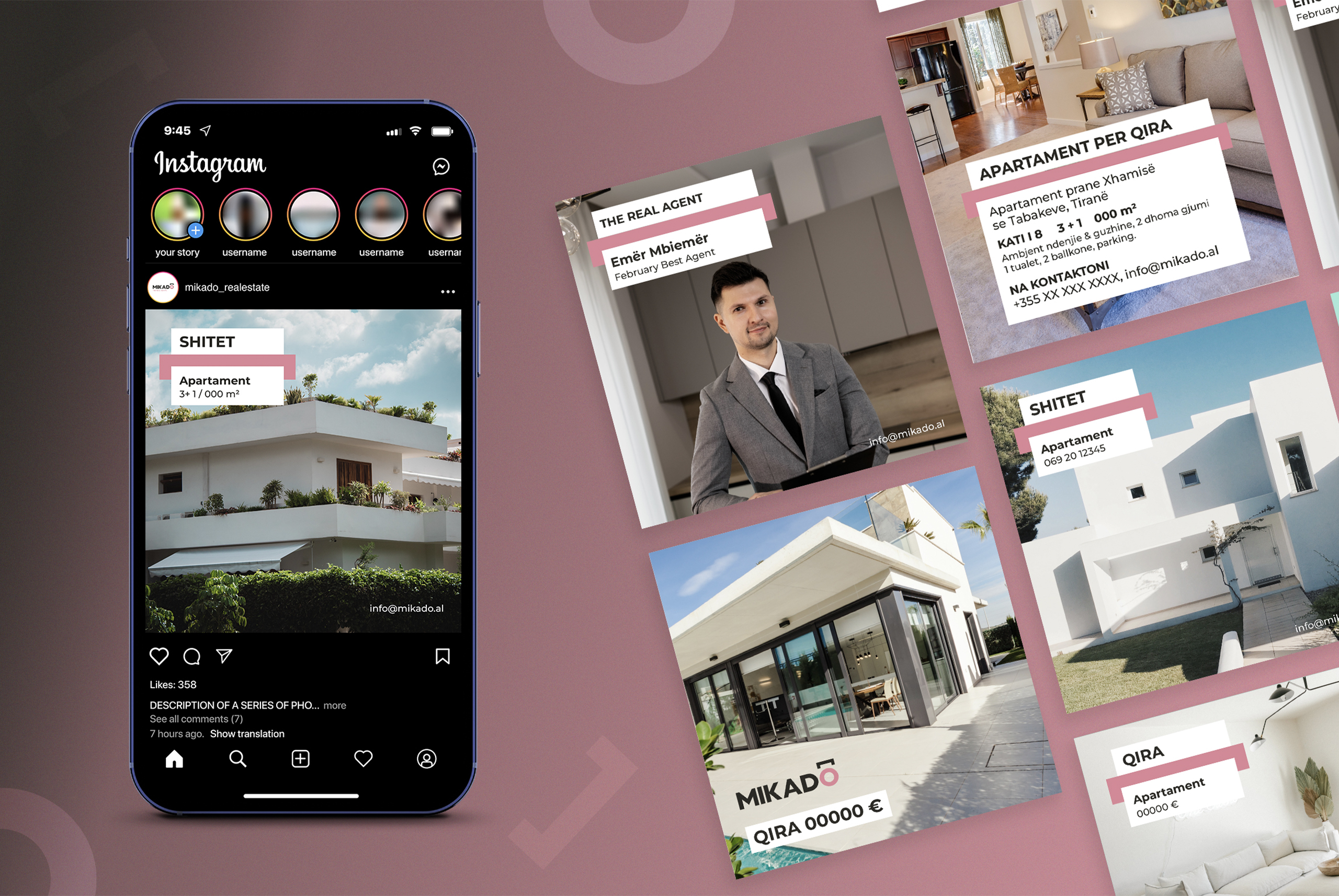
Thus, we reached the result we aimed for: A logo that emphasizes Mikado as a real estate agency, declaring it a market leader. This well-thought-out logo, accompanied by the slogan “The real agents”, in both English and Japanese, was followed by our rigorous work to create a full brand book, office products, as well as original and different templates for social media. All that is left for Mikado now is to shine.