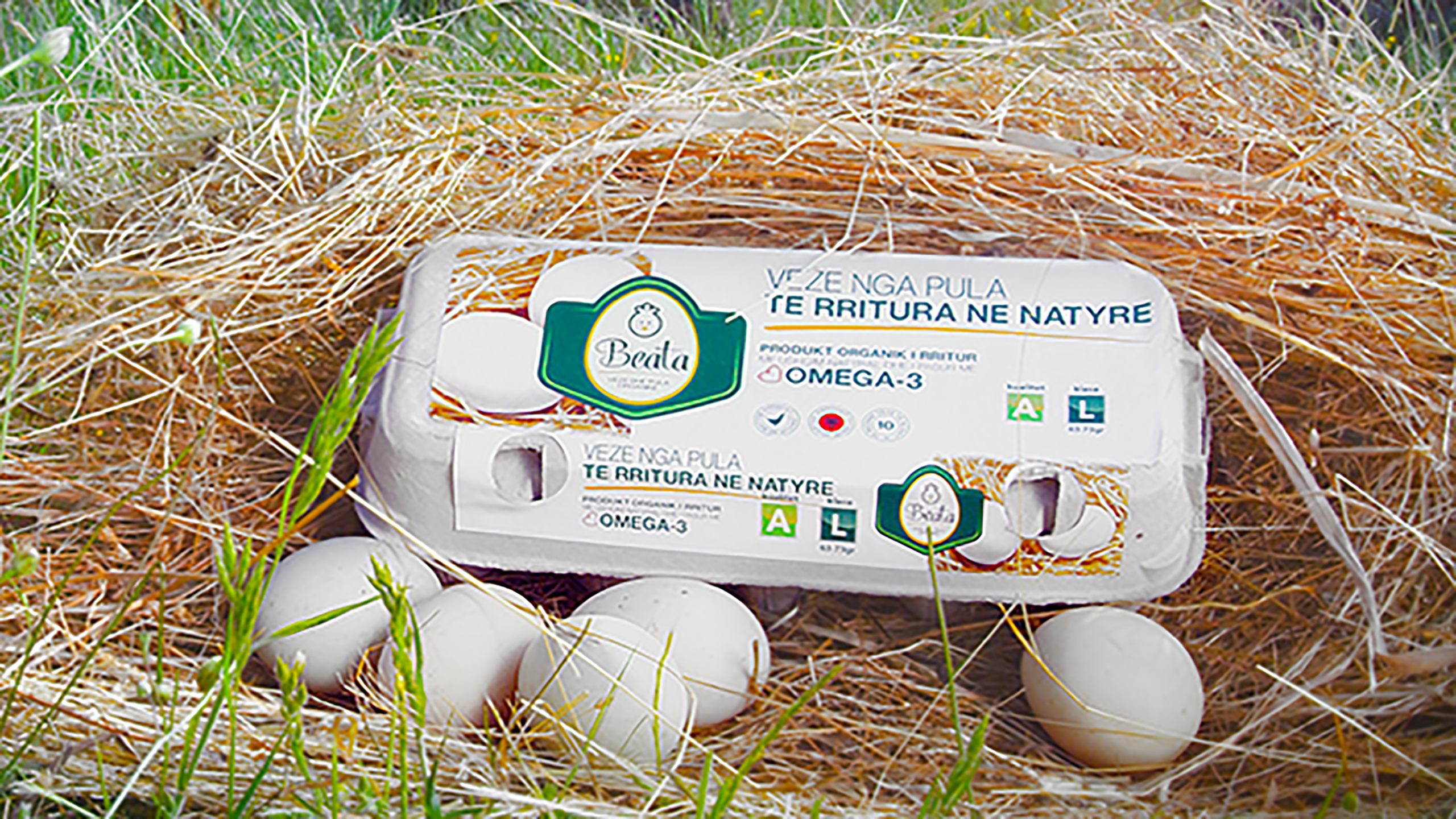
As one of the largest investment in North Albania, Beata was created with the purpose to be a leader company in the poultry sector. The farm is focused in raising egg-laying and meet producing chickens and also in the sales of the product to the consumer through its distribution agents to the best Albanian stores and supermarket chains. This process is also supported by the network of stores owned by the company. This investment is one hundred percent Albanian. Vatra was contracted since the initial faces of the investment to create a competitive brand for the Albanian as well as the regional market. The image must be attractive, eye catching, bringing to mind the nature and the product through the elements that will be used. All the elements of the image must be in harmony and highly appealing to the public generating emotional engagement. Following the research phase which focused on all company topics and features, its activity and location, Vatra decided to name the brand “Beata”. This simple name is memorable, emotionally and commercially appealing and based on the products and location of the company. It derives from “Lake Labeatis” which is the ancient name for Shkodra Lake and comes in honor of the Labeatis family which ruled the area in those times. Beata brand is designed with modern techniques which position the brand in the category of companies with a clear visual image that highlights the special care for the quality of the product. The elements that are used come from the products that the company offers. They are harmoniously put together to form a clean and informative logo. Completed with the symbol, wordmark and tagline, the brand was later applied in all identity elements. Modernism is evident also in the packaging design which is minimalist and informative, including important elements for the consumer which are obligatory based on binding legislation on labeling and packaging of food products in the EU.


